UTMB World Series
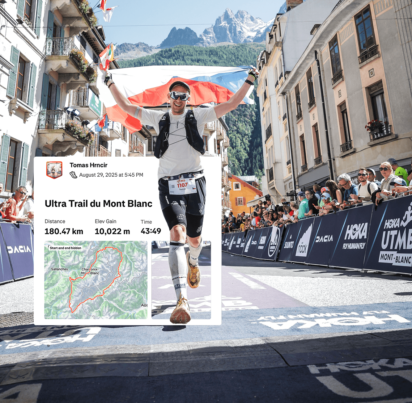
Ultra-marathons have fueled my passion for years, and 2026 was the ultimate highlight—I scored a spot in the legendary Ultra Trail du Mont Blanc, a 100-mile adventure around Mont Blanc’s majestic peaks. While prepping for the race, I saw a chance to rethink UTMB’s digital products. Their website and LiveTrail app are essential for runners and fans alike, so I set out to redesign both for a more user-friendly experience.
Services
Product Design, Rapid Prototyping, Information Architecture, Branding
Services
Product Design, Rapid Prototyping, Information Architecture, Branding
Services
Product Design, Rapid Prototyping, Information Architecture, Branding
Tools
Figma, Perplexity, Figma Make
Tools
Figma, Perplexity, Figma Make
Tools
Figma, Perplexity, Figma Make
Value
Simple, Modern, Fresh, Quick
Value
Simple, Modern, Fresh, Quick
Value
Simple, Modern, Fresh, Quick
Timeline
1 Day
Timeline
1 Day
Timeline
1 Day
Live Trail App
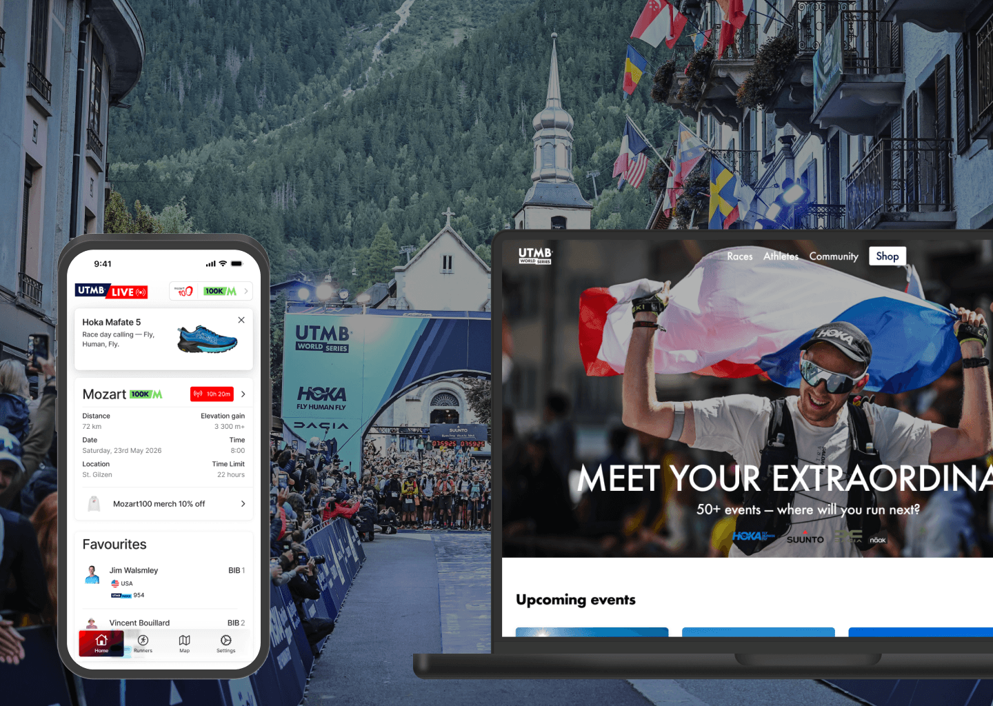
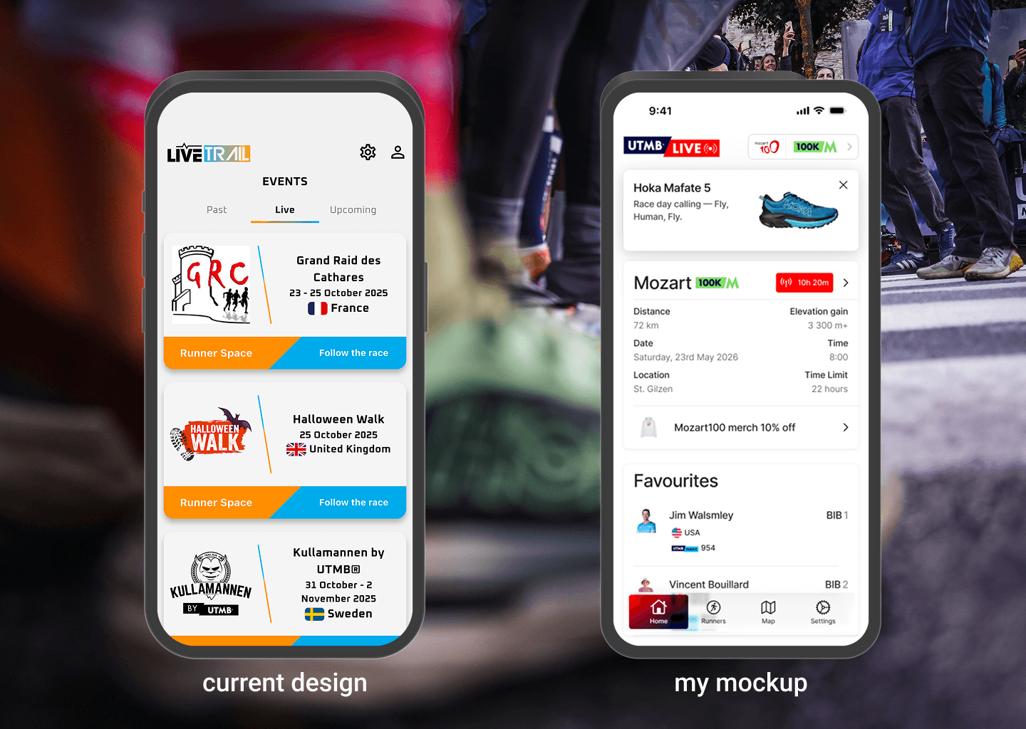
For the LiveTrail app redesign, I dove into iOS 26’s Liquid Glass aesthetic to bring a fresh, modern feel. The sleek new bottom navigation bar is now the heartbeat of the app, giving users quick access to all key sections with just a tap — goodbye clutter, hello clarity!
One of the biggest UX wins was rethinking how users switch between races and distances. Now this essential control sits comfortably in the header, making navigation seamless and intuitive. It’s all about reducing friction with endless back button, so users can focus on what matters: tracking their race and cheering on their favorite runners.
To boost engagement and revenue opportunities, I introduced two smart promo banners: one with a general e-shop discount and another dynamically tied to the current live race, so everything feels relevant and timely. The entire look and feel now harmonizes perfectly with the broader UTMB brand ecosystem, offering a cohesive experience from website to app.
Live Trail App
For the LiveTrail app redesign, I dove into iOS 26’s Liquid Glass aesthetic to bring a fresh, modern feel. The sleek new bottom navigation bar is now the heartbeat of the app, giving users quick access to all key sections with just a tap — goodbye clutter, hello clarity!
One of the biggest UX wins was rethinking how users switch between races and distances. Now this essential control sits comfortably in the header, making navigation seamless and intuitive. It’s all about reducing friction with endless back button, so users can focus on what matters: tracking their race and cheering on their favorite runners.
To boost engagement and revenue opportunities, I introduced two smart promo banners: one with a general e-shop discount and another dynamically tied to the current live race, so everything feels relevant and timely. The entire look and feel now harmonizes perfectly with the broader UTMB brand ecosystem, offering a cohesive experience from website to app.

UTMB Website
Let’s talk web experience. As a regular user, I found myself lost in a maze of menus and distractions—so my redesign started with ruthless simplification. Navigation is now ultralight (like my race vest, lol) — just the essentials, so users can find their next adventure in seconds, not minutes.
Front and center: “Upcoming Events.” All open races, neatly displayed with bold visuals, are just a scroll (or swipe) away. No more endless digging—signups are just a click from the starting line.
But here’s where it gets fun: the interactive map. Instead of hiding it deep in the site, it’s now a hero on the homepage. Users can explore, filter, and zoom into race locations worldwide.
Down the page, I streamlined supporting sections to keep things clean and actionable. Whether you’re looking for the latest news, inspiration, or just a hit of FOMO, everything’s within ultra-fast reach.
Finish Line
This “side quest” took me about a day, but wow—what a rush! Rapid-fire projects like this keep my creative muscles in shape and my design mind wide open. Hope this case study sparked some ideas… or maybe even inspired your next race!
Reach out anytime
Let’s Stay Connected
Have an idea, a question, or just want to talk about design? I’m always happy to connect—whether it’s about a new project or just a good conversation.
Reach out anytime
Let’s Stay Connected
Have an idea, a question, or just want to talk about design? I’m always happy to connect—whether it’s about a new project or just a good conversation.
Reach out anytime
Let’s Stay Connected
Have an idea, a question, or just want to talk about design? I’m always happy to connect—whether it’s about a new project or just a good conversation.
UTMB World Series
Ultra-marathons have fueled my passion for years, and 2026 was the ultimate highlight—I scored a spot in the legendary Ultra Trail du Mont Blanc, a 100-mile adventure around Mont Blanc’s majestic peaks. While prepping for the race, I saw a chance to rethink UTMB’s digital products. Their website and LiveTrail app are essential for runners and fans alike, so I set out to redesign both for a more user-friendly experience.
Services
Product Design, Rapid Prototyping, Information Architecture, Branding
Services
Product Design, Rapid Prototyping, Information Architecture, Branding
Services
Product Design, Rapid Prototyping, Information Architecture, Branding
Tools
Figma, Perplexity, Figma Make
Tools
Figma, Perplexity, Figma Make
Tools
Figma, Perplexity, Figma Make
Value
Simple, Modern, Fresh, Quick
Value
Simple, Modern, Fresh, Quick
Value
Simple, Modern, Fresh, Quick
Timeline
1 Day
Timeline
1 Day
Timeline
1 Day
Live Trail App
For the LiveTrail app redesign, I dove into iOS 26’s Liquid Glass aesthetic to bring a fresh, modern feel. The sleek new bottom navigation bar is now the heartbeat of the app, giving users quick access to all key sections with just a tap — goodbye clutter, hello clarity!
One of the biggest UX wins was rethinking how users switch between races and distances. Now this essential control sits comfortably in the header, making navigation seamless and intuitive. It’s all about reducing friction with endless back button, so users can focus on what matters: tracking their race and cheering on their favorite runners.
To boost engagement and revenue opportunities, I introduced two smart promo banners: one with a general e-shop discount and another dynamically tied to the current live race, so everything feels relevant and timely. The entire look and feel now harmonizes perfectly with the broader UTMB brand ecosystem, offering a cohesive experience from website to app.
UTMB Website
Let’s talk web experience. As a regular user, I found myself lost in a maze of menus and distractions—so my redesign started with ruthless simplification. Navigation is now ultralight (like my race vest, lol) — just the essentials, so users can find their next adventure in seconds, not minutes.
Front and center: “Upcoming Events.” All open races, neatly displayed with bold visuals, are just a scroll (or swipe) away. No more endless digging—signups are just a click from the starting line.
But here’s where it gets fun: the interactive map. Instead of hiding it deep in the site, it’s now a hero on the homepage. Users can explore, filter, and zoom into race locations worldwide.
Down the page, I streamlined supporting sections to keep things clean and actionable. Whether you’re looking for the latest news, inspiration, or just a hit of FOMO, everything’s within ultra-fast reach.
Finish Line
This “side quest” took me about a day, but wow—what a rush! Rapid-fire projects like this keep my creative muscles in shape and my design mind wide open. Hope this case study sparked some ideas… or maybe even inspired your next race!
Reach out anytime
Let’s Stay Connected
Have an idea, a question, or just want to talk about design? I’m always happy to connect—whether it’s about a new project or just a good conversation.
Reach out anytime
Let’s Stay Connected
Have an idea, a question, or just want to talk about design? I’m always happy to connect—whether it’s about a new project or just a good conversation.
Reach out anytime
Let’s Stay Connected
Have an idea, a question, or just want to talk about design? I’m always happy to connect—whether it’s about a new project or just a good conversation.